Why Most PLG Activation Flows Fail at Step Two
There’s a pattern I keep seeing across PLG products, and it’s not where most teams think the problem is.
Step one works fine. User signs up. Email confirmed. Maybe they answered a quick onboarding survey — role, company size, what brings them here. The product team spent six weeks optimizing that signup flow. Conversion rate looks good. Dashboard looks healthy.
Then step two happens.
The user lands inside the product. And the product… waits.
The Gap Nobody’s Measuring
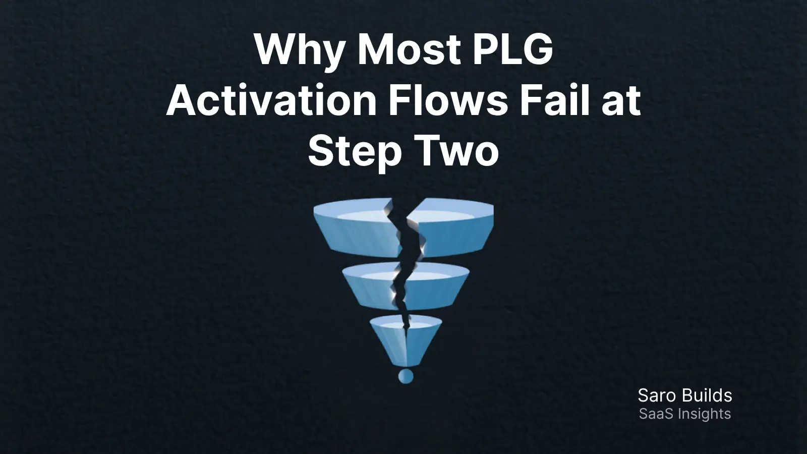
Most teams treat activation like a funnel with clean stages: signup → onboarding → aha moment → retained user. The metrics they track are completion rates on the onboarding checklist, time to first key action, maybe a 7-day activation rate.
What they don’t track well is the moment between step one and whatever comes next.
That moment is where users decide whether to keep going.
Research on empty state UX puts it bluntly: users decide whether to invest time learning a product or move on to alternatives within the first session. We’re not talking about a 30-day retention problem. We’re talking about a decision made in the first few minutes — often on the first meaningful screen the user actually has to do something on.
Step one (signup) is designed. Step two (the blank dashboard, the empty canvas, the “you have no projects yet” screen) often isn’t.
What Step Two Actually Is
Step two is the first moment of user agency.
Up until that point, the product is doing things to the user: asking questions, confirming identity, explaining features, showing a tour. The user is a passenger.
Step two is when the user has to drive. And most products hand them the keys, say “have fun,” and walk away.
This is the blank state problem — but it’s bigger than UI. It’s a jobs-to-be-done failure. The user arrived with a job in mind. The product’s job at step two is to immediately make that job feel achievable. Instead, what most products deliver is cognitive load and a faint sense of dread.
Empty states trigger what UX researchers call cognitive paralysis — users genuinely don’t know what to do first. Blank form fields and empty spaces have been shown to trigger the same stress response as public speaking. That’s not a copy problem. That’s a product design problem.
Why Teams Miss This
A few reasons this keeps slipping through.
The data hides it. Drop-off at step two often shows up as “low 7-day activation” or “users who never returned after signup.” Teams blame the email sequence, the welcome tour, the lack of in-app nudges. The real issue is that the user bounced before any of that had a chance to matter.
The team optimized the wrong thing. Signup flow gets obsessive attention because it has a clear conversion metric. The post-signup experience is murkier — harder to A/B test, harder to attribute. So it gets less love. Onboarding flows fail when they prioritize what the product team wants users to see over what users actually need to do to experience value.
The aha moment is defined too late. Most PLG teams have a concept of the activation event — the thing a user does that predicts retention. But they haven’t mapped the steps between signup and that event clearly enough to see where the drop-off actually lives. If you know 30% of users activate but you don’t know which step in the flow is bleeding users, you’re flying blind.
The Specific Failure Mode
Here’s the specific thing that goes wrong at step two.
The user finishes the onboarding survey (or skips it). They land on a dashboard. The dashboard is empty. There’s a prominent “Create your first [thing]” button.
The user stares at it.
They don’t know what a good [thing] looks like. They don’t know what they’re supposed to put in it. They don’t want to do it wrong. So they don’t click. They poke around a bit. They go back to their tab with 14 other things open. They don’t come back.
Users instinctively interpret blank screens through three lenses: technical failure, product confusion, or unappealing value. None of those interpretations lead to activation. All of them lead to churn.
The irony is that the product probably has exactly the value the user was looking for. The user just couldn’t see it from where they were standing.
What Good Step Twos Look Like
The products that solve this don’t wait for the user to build something. They show the user what “done” looks like first.
Notion doesn’t show you a blank page. It shows you a template gallery organized by use case. Airtable gives you sample bases. Figma gives you example files. The pattern is consistent: give users a starting point, not a blank canvas. “Pick a template” is a much easier ask than “imagine what you want.”
The underlying principle is a JTBD one. The user’s job isn’t “create a project.” Their job is “understand how this thing helps me do the thing I actually care about.” Step two should answer that job immediately — not through a tooltip or a guided tour, but by putting a working example of the product’s value directly in front of them.
A few things that move the needle:
Sample data, not empty screens. Let users interact with a pre-populated version of the product before asking them to build anything. The bar for “try it” is much lower than “set it up.”
Outcome-first framing. The first action in the flow should visibly connect to an outcome, not a setup task. “See what your [report/campaign/pipeline] looks like” is a different psychological ask than “add your first record.”
Progressive setup. Don’t ask users to import a full CSV, connect all integrations, or fill out a complete profile before they see what the product does. Ask for data after they’ve seen value — not as the price of admission to it.
One next action, clearly surfaced. The step two screen shouldn’t have five things to do. It should have one, with enough context that the user understands both what it is and why it matters.
The PM Takeaway
If you’re working on a PLG product and your activation rates are underwhelming, don’t start by auditing your email sequences or redesigning your feature tour.
Start by watching session recordings of users who signed up and never came back. Find the exact moment they stopped. In most cases, it’s earlier than you expect — and it’s sitting right at the edge of that first blank screen.
Onboarding drop-offs are usually an indication of friction, not rejection. The user didn’t decide they didn’t want your product. They decided the effort of figuring it out wasn’t worth it right now.
Step two is your one shot at changing that math.
Most teams design step one obsessively and leave step two to chance. The teams that win in PLG treat step two as seriously as the signup form — because it’s where the real conversion happens.
Written by Saro — founder, ex-Head of Product, and occasional complainer about onboarding flows that make me feel dumb.